My Magazine website

My Magazine website
Click the above image to view my website

My magazine cover, Edition 1

My magazine contents page, Edition 1

My magazine cover, Edition 2

My magazine contents page, Edition 2

Sunday 28 October 2018

9. Second Webpage


An example of a secondary website page that greatly inspired my own during the planning process:


A rough plan which was created throughout the planning process of my secondary page:


I aimed to create a consistent house style through the continued use of my black and white 'Identity banner at the top to provide synergy as well as using the same bold 'Arial-like' fonts. I also continued to utilise my frame within a frame motif, although I used a much more discrete version featuring the two perpendicular lines present in the final product.

Some of the audience feedback I got on my website:
  • Enlarging the images to give thema greater presence
  • adding a few extra details to highlight the content, which I added in the form of the repeated 2-line motif on both my homepage and 'Fashion' tab
  • changing content to reflect a balanced-gender approach

Below is a screenshot from my 2nd page


8. Website Homepage


A couple of homepages that greatly inspired my own r during the planning process:


A rough plan which was created throughout the planning process of my homepage:


I aimed to create a consistent house style through the continued use of my black and white 'Identity banner at the top to provide synergy as well as using the same bold 'Arial-like' fonts. I also continued to utilise my frame within a frame motif, although I used a much more discrete version featuring the two perpendicular lines present in the final product.

Some of the audience feedback I got on my website:
  • An increased sense of immeadiacy and current news, which I responded to by adding a live twitter feed and a 'latest news' section
  • spacing out the elements a bit more to avoid cramping
  • cropping of images used to highlight subjects more

Below is a screenshot of my final website homepage


7. Magazine Edition 2: Cover and Contents Page


A cover that greatly inspired my own first front cover during the planning process:


A rough plan which was created throughout the planning process of my first cover:


I aimed to create a consistent house style through my use of consistent black and white motifs, playing on the ideas of contrast and juxtaposition. I aimed to use a repeated 'frame within a frame' layout to highlight the subject of the focal image as well as provide additional room for extra conventions around the outside such as turns, prices and barcodes.

Some of the audience feedback I got on my second front cover:
  • Reduce the border size to give the focal image more space
  • crop into my focal image more to highlight the model
  • add a circular turn graphic to become more conventional
  • blur the background to increase focus on model
  • give coverlines a more 'digital special' theme


Below is the shot list for my second cover:


Below is an inspirational contents page for my fist issue:


Below is a rough sketch of my own second contents page:


Some of the audience feedback I got on my second contents page:
  • change the large black border as it didnt suit the conventions of a normal contents page
  • change images used to give a more neutral gender balance
  • add an additional image of clothing
  • change the black and white colourway to increase aestheticism 

Below are my finished cover and contents page for my second issue:


6. Magazine Edition 1: Cover and Contents Page


A cover that greatly inspired my own first front cover during the planning process:


A rough plan and a mock up which were created throughout the planning process of my first cover:


I aimed to create a consistent house style through my use of consistent black and white motifs, playing on the ideas of contrast and juxtaposition. I aimed to use a repeated 'frame within a frame' layout to highlight the subject of the focal image as well as provide additional room for extra conventions around the outside such as turns, prices and barcodes.

Some of the audience feedback I got on my first front cover:
  • Reduce the border size to give the focal image more space
  • add more coverlines at the bottom of the page to cut empty space and become more conventional
  • add a circular turn graphic to become more conventional
  • change the price of my magazine


Below is the shot list for my first cover:


Below is an inspirational contents page for my fist issue:


Below is a rough sketch of my own first contents page:


Some of the audience feedback I got on my first contents page:
  • change the large black border as it didnt suit the conventions of a normal contents page
  • add more cover lines
  • add an additional image of clothing
  • add some form of digital convergence on the page to direct readers to the website

Below are my finished cover and contents page for my first issue:


Friday 26 October 2018

5. My Proposal/Response to the Brief


The brief states I that must create the first two editions of a new fashion magazine produced by an independent magazine production company and distributed by Bauer Media to commercial retailers. It has to be aimed at 16-25 year olds of the AB social demographic and are culturally sophisticated. I must make this apparent in the diverse range of fashion issues and styles included in the magazine. I must also produce a website homepage and one other linked page. There must be a clear sense of branding and synergy across both products.

Here is an overview of my intentions for my response to the brief:

Title- Identitiy
Tagline- Identity is the Mother of Creation
Price- £6.50
Mission- To bring readers the latest from the streets, whilst interweaving themes of current affairs, social issues and cultural information.


The two magazine covers and contents pages must include:
  • four different main images,
  • using original photography,
  • editing of photos, text, graphics, typography and layout,
  • written text including masthead, cover lines, selling lines, headlines, caption, subtitles and copy, 
  • a different setting for each cover,
  • different material on each content page,
  • at least two models from at least two different social groups,
  • a call to action pointing readers to the website. 
Here are some covers and contents pages I aim to draw from:


Here are my rough plans for my two covers and a rough plan for contents page style, as well as a mock up front cover:


One thing I am going to try and play on is having a really strong and unique house style. I hope to achieve this through my magazine's easily identifyable 'border' with strong black and white themes at the core of everything. The border will use frames within frames to accentuate all of the content within the rectangle.


The website homepage and linked page must include:


  • at least two original images that promote and reinforce the brand identity of the magazine,
  • appropriate conventions of website design,
  • text introducing the main features of the online website,
  • working links from the homepage to the other page,
  • a range of appropriate media techniques,
  • original audio or audio-visual content.

Here are some rough plans for my website homepage and 2nd linked page (a fashion tab):


On both my website pages I will feature a social media bar that 'follows' you as you scroll down the page meaning that my magazine's social media will always be in the corner of your eye. I will also create Twitter and Instagram pages for my magazine in order to be as digitally convergent as possible, something which every successful modern magazine takes very seriously.

Here are some website pages which I aim to draw further inspiration from:


In order to obtain all the shots I need it will be important to have a plan in place, which includes all the various shots I need. Below is a sample page from my shotlist which I have compiled.


It is also important to bear in mind that my magazine will be published by an independent production company created by me. Here is my idea for my company's logo:


4. Representation


In recent times, magazines such as Cosmopolitan and Pride have striven to make the media more inclusive to minority groups. Given that my target audience is"culturally sophisticated", I believe that including liberal and forward thinking ideas and elements both on and in my magazine would be crucial to appealing to my TA.


In the issue of Cosmopolitan on the left, the focal image is of Tess Holiday, a famous plus-size model who promotes more forward thinking and accepting ideas about non-conventional types of beauty i.e. plus-size models. In mainstream media overweight women are generally presented as unattractive and undesirable, however the use of costume and high-key lighting counters these beliefs and show that you don't need to be skinny to be attractive and feminine. On the cover Tess is seen in MLS framing blowing a kiss at the reader, with her other hand on her hip. The confidence connoted from this gesture encourages anyone who is not 'conventionally beautiful' that they do not need to fit within stereotypical boundaries to be attractive, just as Tess does. Similar ideas would be appropriate to consider for my own project as my TA is 'culturally sophisticated' so ideas and concepts like this will likely appeal to them. Theorist Richard Dyer states that 'stereotypes legitimise inequality'. This means that in order to challenge this inequality it will be important to not portray models as hyper-stereotypical figures and show sides to them that perhaps wouldn't be showed in mainstream media.


On the cover of the issue of Pride we see a MS of Zazie Beets, actress in shows such as Atlanta and Deadpool, who also has a skin condition called vitiligo which affects the area under and around her left eye. Vitiligo is not something which traditional mainstream media would have featured on a fashion/beauty front cover as it may have been perceived as 'imperfect' so the fact that new wave publications such as pride are featuring Zazie indicates an increase in demand for models and topics which do not conform to the 'norms'. Media theorist Gerbner theorises that repeated exposure to patterns of representation can eventually shape the way people perceive the world. As my target audience is young and 'culturally sophisticated', forward-thinking concepts which break and contrast the 'repeated exposure' from mainstream media is something that may appeal to them so making my magazine's brand values as inclusive and progressive as possible is something I am definitely aiming to do.


3. Codes and Conventions


Front Covers

In order to produce an effective, conventional and appealing magazine front cover, it is essential to examine previous covers to determine what codes and conventions it could be useful to include within my own work.

Typical magazine front covers incorporate a multitude of conventions in order to signify to the TA that the product is indeed a magazine at a glance. A list of these features include:
  • A focal image, typically of a person(s) of interest
  • Mastheads
  • Date lines 
  • Price lines
  • A complimentary background which doesn't detract from the focal image
  • Web address
  • Cover lines containing information about the contents of the magazine
  • A bar code
  • Some form of direct address
  • utilisation of semiotics- Barthes theory of signs refers to coded information placed within front covers which the TA can then decode and identify with. 


The use of a newspaper-like headline is sometimes employed to provide not only some context for the cover image but also context for perhaps the main theme of the issue or the big story within the magazine. They tend to be the next boldest thing after the title/name of the magazine, and provide just enough context to anchor the main image, whilst still leaving some intrigue as to the content within. This has been documented by theorists such as Barthes, whose enigma code theory explores why mysteries appeal to audiences. This sleight omission of imformation entices the TA to purchase the magazine and find out more- this is something I am aiming to include within my own product.


Another convention that I wish to include on my own front cover is the use of a frame within a frame. This stylistic choice further draws attention to the focal image, whilst allowing for a potential sense of depth. In this instance, Kanye's face and hand seem to be almost popping out of the cover, especially when you compare the TIME cover with the 10 cover, which looks quite 2D in comparison. Depth is something which I could use to bring focus to/highlight the outfit of a model on the cover, or perhaps a specific item of clothing.


Some magazines choose to use plain coloured backgrounds, which either satisfyingly offset the colours of an outfit (as seen on the left) or match them in order to create a theme. I beleive this could be deployed especially usefully within the fashion magazine genre, where in many cases, the visual elements can be more important to a reader than many other aspects of the magazine. This is apparent in magazines such as  Pigeons and Peacocks, where the aesthetic elements seem to be some of the most important parts of the magazine, with many sections consisting of only images of models, with minimal/no anchorage.


Homepages

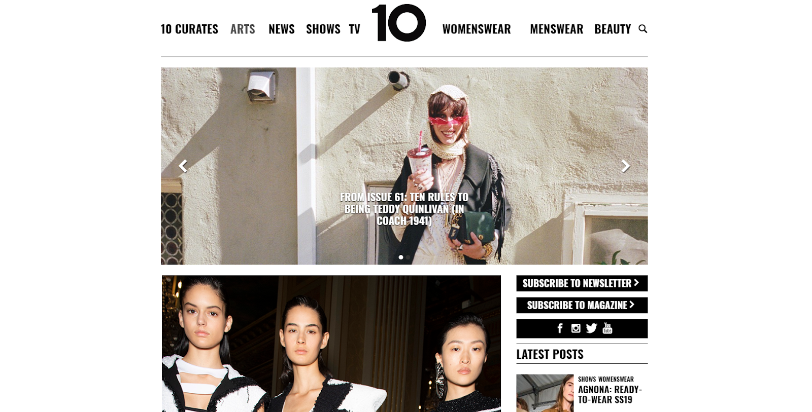
One thing that I have noticed about many fashion magazine website homepages is that they tend to be relatively plain, with no noisy colours/ patterns or background images. I beleive this is to allow for the featured images/articles to take prominance, as these are why anyone would come to the website and so to detract from their impact with gaudy and garish background content wouldnt make sense. I am planning to recreate this simple, but effective style with my own website. There are a few example website homepages below. Websites are also platforms where genre hybridity is especially apparent. For example on the Vogue homepage, the large featured article pertains to the 'Vogue Film Festival', something which in itself is not fashion related but because it has the Vogue brand name associated to it it automatcially comes with fashion connotations, whilst also appealing to a different secondary audience of film-fans and hence potentially increasing readership figures. Another popular feature on modern magazine homepages is to have links to various social media platfroms, as done especially boldly on 10 Magazine's homepage. This allows the target audience to interact with the magazine in a multitude of ways and really increase their involvement with the brand. This is something that it will be important to bear in mind when creating my own website if I want to create an authentic and effective website.


Something else I have noticed is a popular feature of many fashion magazine websites is a pop-up landing page which appears when you first get on the site asking you to sign up to 'the newsletter', which would then provide them with updates and information about the magazine. This is effective as it feels like the magazine is being inclusive toward the TA, whilst allowing the magazine to push deals and offers to the audience and allows them a direct line of appeal. I am considering employing this same tactic with my own magazine.


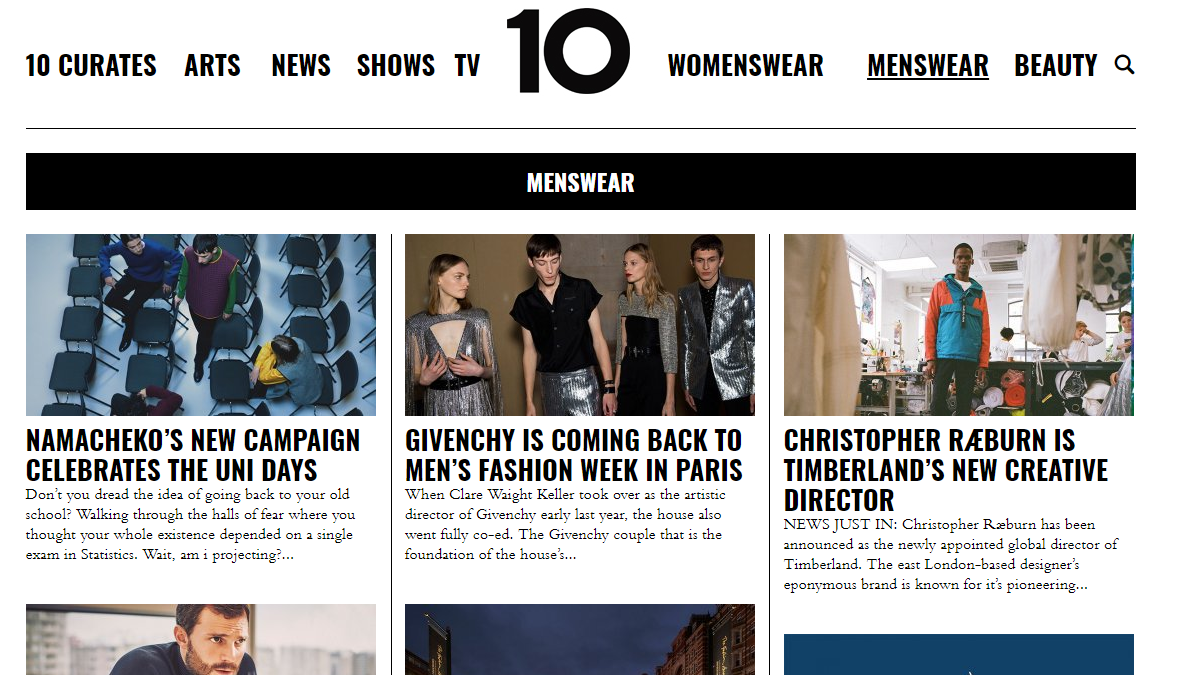
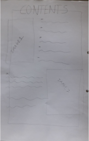
From my research into magazine contents pages, it has become clear to me that there are a few universal codes and conventions which most fashion publications use. Firstly, the use of a singular, large focal image which is used to highlight one of the features within the issue. For example, the MS of Kanye West informs the reader in an instant that that weeks edition of Vibe Magazine will contain a story on the rap artist. Additionally, the layout of the article headlines generally is the same in many publications, where they run vertically down either side of the page in order to make room for the main image. Furthermore, magazines employ large mastheads which are effective in the sense that they help provide context for the page, however, I believe that if done correctly, slightly altering the masthead can also benefit the aesthetic of the contents page. For example, the way the word 'contents' has been rearranged into three rows in Vibe magazine effectively occupies the space whilst also fitting with the quite hard and clean cut nature of the cover. I am going to try and see how I can play with similar ideas for my own contents page in order to create an uncommon and different layout whilst remaining conventional.


2. Industry


My magazine is going to be published by Bauer Publishing. They are highly prolific publishers and print the worlds No.1 and 2 best selling magazines at retail. Bauer have a diverse plethora of publications and print over 600 magazines, with a diverse breadth of content.
The first thing you see on the website is the slogan " We Think Popular." which indicates that whilst, I would like to give my magazine a more indie vibe, it must have a relatively mainstream, or 'popular'
feel to it. 


One of  Bauer Publishing's main fashion magazines, and the closest competition to my own magazine in terms of content is 'Grazia'. The Bauer website states that Grazia is: "Brave, bold, innovative", which are all aspects that I hope my own magazine will have, furthermore our magazines share a common AB audience. On the other hand, the Grazia audience is mostly female and older than my own, with the core demographic being "25-45 year old women". This means that it is plausable that Bauer could publish a more indie fashion magazine, aimed at a younger audience as the two publications would not be in direct competiton with each other.


Magazine sales in general have declined in recent times, for example 'Vogue' (a contempory fashion magazine) has seen its sales fall by 2.6% and 'Grazie' has seen drops in sales of 13.4%. To me, this indicates a deterioration in the breadth of people reading fashion magazines and hence a gap in the market for a magazine to break through and target the younger groups in society- something I aim to do with my own magazine.

Regulation for magazines is left to IPSO (Independant Press Standards Organistion) who are "the independent regulator for the newspaper and magazine industry in the UK". On their website they claim to "hold newspapers and magazines to account for their actions, protect individual rights, uphold high standards of journalism and help to maintain freedom of expression for the press."
One of the ways in which they do this is to make sure all publications uphold the 'Editors' Code'- which is a set of rules to ensure that any publication has integrity and is not damaging to society in its message. This is important to consider as I do not wish for my magazine to be censored, which can happen if information provided is innacurate, with a recent example of this being The Times' article on international politics sparked by the curruption within FIFA- where false claims were made about certain individuals.

Independent magazine production companies are not too common in the modern market, however in recent times a few have discovered success in niche markets. For example, Kinfolk Magazine is an indie magazine production company whose publication has gone worldwide and been translated into Chinese, Russian, Japanese and a readership of over 55,000. The fact that Kinfolk is independently produced but not independently distributed means that they can create a  "distinct ripple in the publishing world with an aesthetic all its own" (Portland monthly), whilst still being able to create and reach a large audience due to the publisher (Ouur).


Increasingly, it is becoming imperative that magazines exapand into all areas online in order to capture the largest possible audience while maintaining a synergistic brand image and converging back to a central hub. In this case, Vogue's instagram displays competant digital convergence by featuring the magazines iconic 'V' logo as its display picture, furthermore, the magazine converges digitally by featuring a link to the homepage. This not only makes it easy, but encourages readers to head back to Vogue's homepage, thus providing the reader with even more content and also exposing them to more advertising opportunities, which enables Vogue to generate more revenue.