My Magazine website

Click the above image to view my website

My magazine cover, Edition 1

My magazine contents page, Edition 1

My magazine cover, Edition 2

My magazine contents page, Edition 2
Friday, 2 November 2018
CLOSING POST
Dear Examiner,
You will find all posts relating to my A level coursework under the label:
'A Level Research and Planning'
I hope you have a pleasant time reviewing my work.
Morgan.
THIS BLOG IS NOW CLOSED.
10. Reflections on Finished Outcomes/ Target Audience Responses
Below are my finished products:
(a link to my website is also provided)
https://latymermedia17.wixsite.com/morgan
I realised that in order to successfully evaluate the effectiveness of my project it would be important to get feedback from my target audience, as I could be too attached to see my products objectively. I gave out 8 surveys to a variety of people who fit into my target audience demographic. I have selected one at random and placed it below.
The survey was completed by a 22 year old female who is a fan of the genre on 28/10/18

Key things that the audience feedback revealed:
- TA members liked the "aesthetic" of my magazine, in particular the "cool border and layout"
- The article content was generally well liked although a few people revealed that they didn't quite understand what some of the content pertained to
- They enjoyed the repeated 'frame-within-fame' motif and felt it made my magazine "different"
- 2/8 audience members thought that my contents pages were somewhat clustered
- The difference in mean overall scores (adding up the four numerical questions and dividing by 4) was only 2 between boys and girls- indicating a relatively good gender balance.
I decided not to act on certain elements of the feedback as I felt like some of the critique arose from responders not being particularly big fans of the genre. For example, the few responses that said they weren't quite sure what certain cover lines pertained to came from people who weren't the biggest fans of the fashion genre, so I wouldn't expect them to have heard of designer 'Virgil Abloh'. I hence felt it was justified to not act on the feedback given that my publication probably wouldn't be aimed at them given their lack of passion for the subject.
I believe that over the course of this project, I have created an effective magazine campaign which fulfills the requirements of the brief. I put together two magazine front covers, two magazine contents pages, a working website as well as audio-visual content and an appropriate social media presence. The different elements are a culmination of all my research into the four key media frameworks and I have used all that knowledge to create a strong brand identity and house style. I believe all of my elements work synergystically to entice the '16-25 year old, culturally sophisticated' TA and encourage them to purchase the magazine.
Sunday, 28 October 2018
9. Second Webpage
An example of a secondary website page that greatly inspired my own during the planning process:
A rough plan which was created throughout the planning process of my secondary page:

I aimed to create a consistent house style through the continued use of my black and white 'Identity banner at the top to provide synergy as well as using the same bold 'Arial-like' fonts. I also continued to utilise my frame within a frame motif, although I used a much more discrete version featuring the two perpendicular lines present in the final product.
Some of the audience feedback I got on my website:
- Enlarging the images to give thema greater presence
- adding a few extra details to highlight the content, which I added in the form of the repeated 2-line motif on both my homepage and 'Fashion' tab
- changing content to reflect a balanced-gender approach
Below is a screenshot from my 2nd page

8. Website Homepage
A couple of homepages that greatly inspired my own r during the planning process:


A rough plan which was created throughout the planning process of my homepage:

I aimed to create a consistent house style through the continued use of my black and white 'Identity banner at the top to provide synergy as well as using the same bold 'Arial-like' fonts. I also continued to utilise my frame within a frame motif, although I used a much more discrete version featuring the two perpendicular lines present in the final product.
Some of the audience feedback I got on my website:
- An increased sense of immeadiacy and current news, which I responded to by adding a live twitter feed and a 'latest news' section
- spacing out the elements a bit more to avoid cramping
- cropping of images used to highlight subjects more
Below is a screenshot of my final website homepage

7. Magazine Edition 2: Cover and Contents Page
A cover that greatly inspired my own first front cover during the planning process:

A rough plan which was created throughout the planning process of my first cover:

I aimed to create a consistent house style through my use of consistent black and white motifs, playing on the ideas of contrast and juxtaposition. I aimed to use a repeated 'frame within a frame' layout to highlight the subject of the focal image as well as provide additional room for extra conventions around the outside such as turns, prices and barcodes.
Some of the audience feedback I got on my second front cover:
- Reduce the border size to give the focal image more space
- crop into my focal image more to highlight the model
- add a circular turn graphic to become more conventional
- blur the background to increase focus on model
- give coverlines a more 'digital special' theme
Below is the shot list for my second cover:

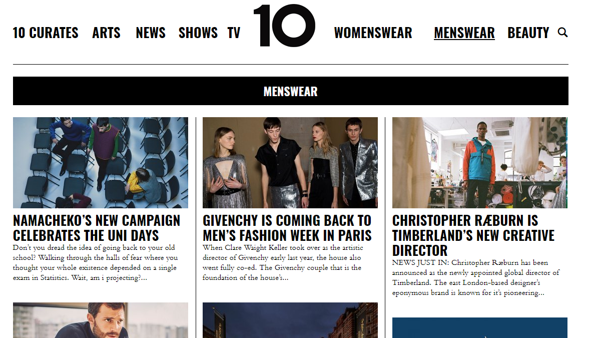
Below is an inspirational contents page for my fist issue:

Below is a rough sketch of my own second contents page:

Some of the audience feedback I got on my second contents page:
- change the large black border as it didnt suit the conventions of a normal contents page
- change images used to give a more neutral gender balance
- add an additional image of clothing
- change the black and white colourway to increase aestheticism
Below are my finished cover and contents page for my second issue:


6. Magazine Edition 1: Cover and Contents Page
A cover that greatly inspired my own first front cover during the planning process:

A rough plan and a mock up which were created throughout the planning process of my first cover:


I aimed to create a consistent house style through my use of consistent black and white motifs, playing on the ideas of contrast and juxtaposition. I aimed to use a repeated 'frame within a frame' layout to highlight the subject of the focal image as well as provide additional room for extra conventions around the outside such as turns, prices and barcodes.
Some of the audience feedback I got on my first front cover:
- Reduce the border size to give the focal image more space
- add more coverlines at the bottom of the page to cut empty space and become more conventional
- add a circular turn graphic to become more conventional
- change the price of my magazine
Below is the shot list for my first cover:

Below is an inspirational contents page for my fist issue:

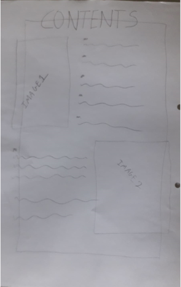
Below is a rough sketch of my own first contents page:
Some of the audience feedback I got on my first contents page:
- change the large black border as it didnt suit the conventions of a normal contents page
- add more cover lines
- add an additional image of clothing
- add some form of digital convergence on the page to direct readers to the website
Below are my finished cover and contents page for my first issue:


Friday, 26 October 2018
5. My Proposal/Response to the Brief
The brief states I that must create the first two editions of a new fashion magazine produced by an independent magazine production company and distributed by Bauer Media to commercial retailers. It has to be aimed at 16-25 year olds of the AB social demographic and are culturally sophisticated. I must make this apparent in the diverse range of fashion issues and styles included in the magazine. I must also produce a website homepage and one other linked page. There must be a clear sense of branding and synergy across both products.
Here is an overview of my intentions for my response to the brief:
Title- Identitiy
Tagline- Identity is the Mother of Creation
Price- £6.50
Mission- To bring readers the latest from the streets, whilst interweaving themes of current affairs, social issues and cultural information.
Mission- To bring readers the latest from the streets, whilst interweaving themes of current affairs, social issues and cultural information.
The two magazine covers and contents pages must include:
- four different main images,
- using original photography,
- editing of photos, text, graphics, typography and layout,
- written text including masthead, cover lines, selling lines, headlines, caption, subtitles and copy,
- a different setting for each cover,
- different material on each content page,
- at least two models from at least two different social groups,
- a call to action pointing readers to the website.
Here are some covers and contents pages I aim to draw from:


Here are my rough plans for my two covers and a rough plan for contents page style, as well as a mock up front cover:


One thing I am going to try and play on is having a really strong and unique house style. I hope to achieve this through my magazine's easily identifyable 'border' with strong black and white themes at the core of everything. The border will use frames within frames to accentuate all of the content within the rectangle.
The website homepage and linked page must include:
- at least two original images that promote and reinforce the brand identity of the magazine,
- appropriate conventions of website design,
- text introducing the main features of the online website,
- working links from the homepage to the other page,
- a range of appropriate media techniques,
- original audio or audio-visual content.
Here are some rough plans for my website homepage and 2nd linked page (a fashion tab):


On both my website pages I will feature a social media bar that 'follows' you as you scroll down the page meaning that my magazine's social media will always be in the corner of your eye. I will also create Twitter and Instagram pages for my magazine in order to be as digitally convergent as possible, something which every successful modern magazine takes very seriously.
Here are some website pages which I aim to draw further inspiration from:


In order to obtain all the shots I need it will be important to have a plan in place, which includes all the various shots I need. Below is a sample page from my shotlist which I have compiled.

It is also important to bear in mind that my magazine will be published by an independent production company created by me. Here is my idea for my company's logo:

Subscribe to:
Posts (Atom)