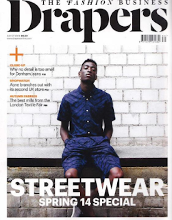
A cover that greatly inspired my own first front cover during the planning process:
A rough plan which was created throughout the planning process of my first cover:
I aimed to create a consistent house style through my use of consistent black and white motifs, playing on the ideas of contrast and juxtaposition. I aimed to use a repeated 'frame within a frame' layout to highlight the subject of the focal image as well as provide additional room for extra conventions around the outside such as turns, prices and barcodes.
Some of the audience feedback I got on my second front cover:
- Reduce the border size to give the focal image more space
- crop into my focal image more to highlight the model
- add a circular turn graphic to become more conventional
- blur the background to increase focus on model
- give coverlines a more 'digital special' theme
Below is the shot list for my second cover:
Below is an inspirational contents page for my fist issue:
Below is a rough sketch of my own second contents page:
Some of the audience feedback I got on my second contents page:
- change the large black border as it didnt suit the conventions of a normal contents page
- change images used to give a more neutral gender balance
- add an additional image of clothing
- change the black and white colourway to increase aestheticism
Below are my finished cover and contents page for my second issue:


No comments:
Post a Comment